Cornett Rebrand Receives GDUSA Design Award
Celebrating inhouse design excellence.
Our recent Cornett rebrand has been honored with a GDUSA Inhouse Design Award. This recognition reflects the creativity, teamwork, and fresh thinking that went into refreshing the Cornett brand.
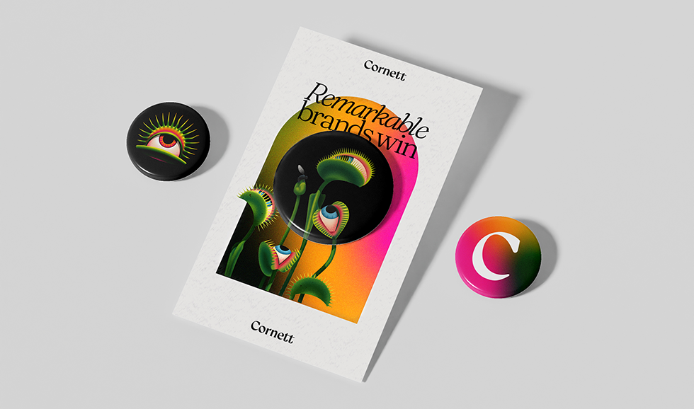
When most agencies were leaning into muted neutrals and forgettable wordmarks, we ditched the playbook and turned to the wild, one‑eyed carnivorous plants of our native Kentucky and let their fierce curiosity fuel a brand that makes noise instead of waiting for it.
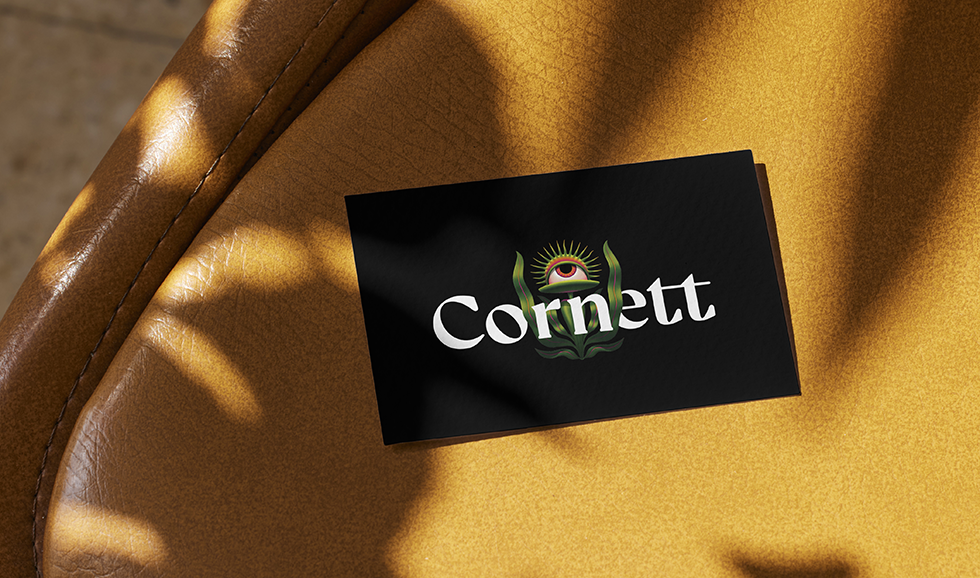
The heart of the new identity? Oddrey. A daring, single‑eyed mark rendered in saturated color. It’s fearless, curious, relentlessly creative — just like us.
To give Oddrey a fuller world, we partnered with surrealist botanical wizard Ana Miminoshvili. Her ethereal illustrations introduced a cast of one‑eyed fungi and a charismatic flytrap ensemble, each becoming a symbolic player in the brand’s story logic.
Our wordmark fuses high‑contrast lettering with serif details pulled straight from plant veins. A fresh palette of vivid gradients and a flexible type system let us balance precision with playfulness across every touchpoint.
The result? An identity that captures attention the way a Venus flytrap snaps up its prey. Quick, decisive, unavoidable.
🏆 Proud to accept GDUSA’s Inhouse Design Award for this work. Read all about the competition and see the other winners on the GDUSA site: GDUSA Inhouse Design Competition 2026
Thank you to every creative mind that turned Kentucky’s wild flora into a brand that refuses to blend in.